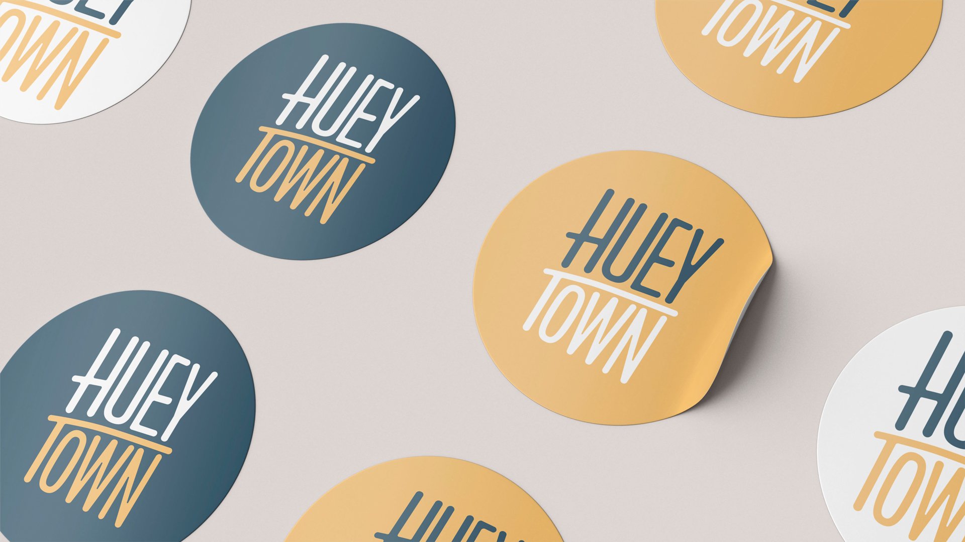
Hueytown
Objective — Create an identity system and logo design for a small town in Alabama.
Concept — According to Hueytown’s website, its main focuses are pride, patriotism, and progress. Because there are no notable landmarks in Hueytown that are noteworthy, the main focuses became the backbone of the rebrand. The new logo is simple and welcoming while prioritizing the “H” and “T” of Hueytown (pride and patriotism); the bar of the “T” arches upward and right indicating progress. A secondary, more personable logo was created for merchandise purposes.
Typography — ITC Franklin Gothic Std by Morris Fuller Benton; Mrs. Eaves XL Serif Nar OT by Zuzana Licko


