Soccer for the Village
Objective — Create an identity system and logo design for the Southwest Atlanta-based non-profit, Soccer for the Village.
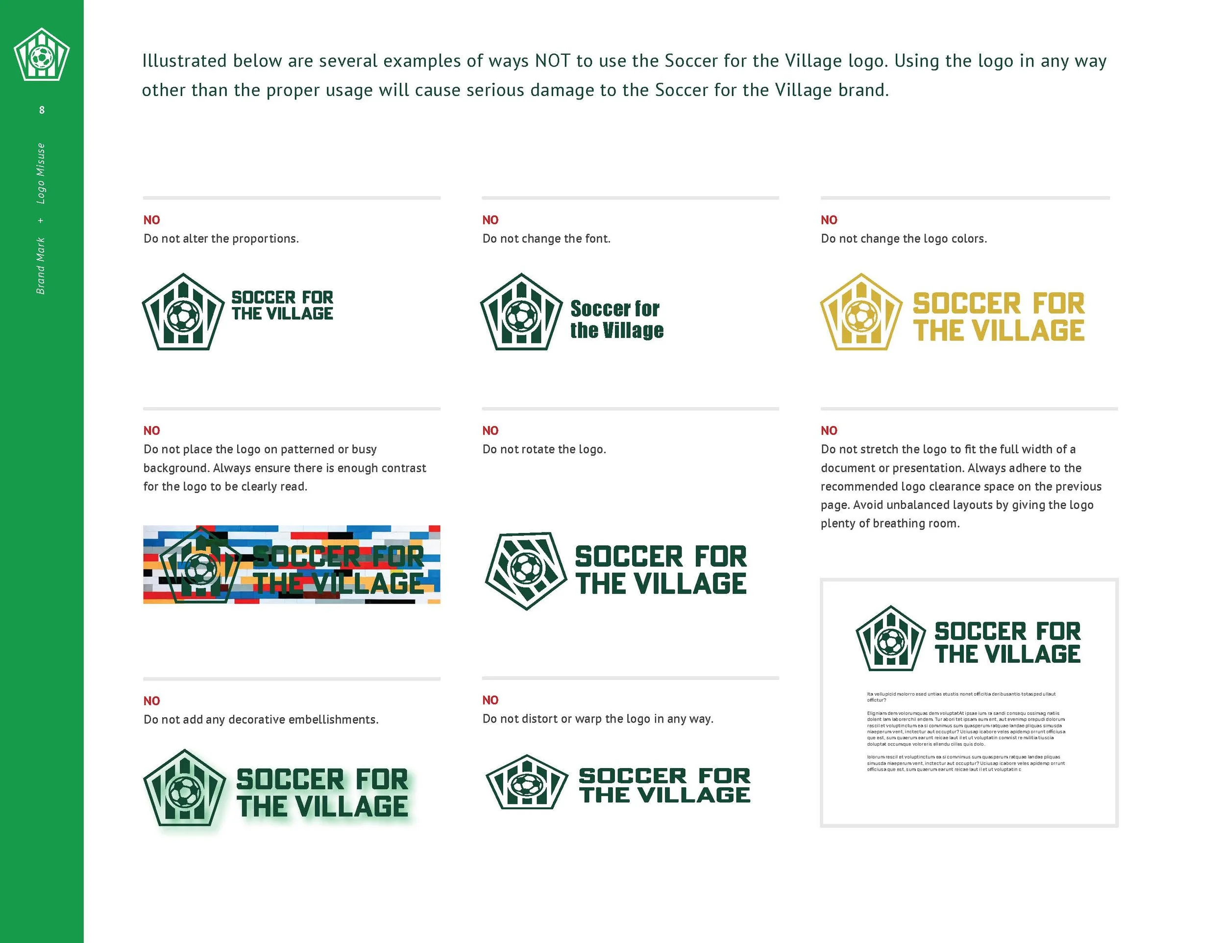
Concept — During my internship at Jackson Spalding, the intern team worked on deliverables for Soccer for the Village; as the only graphic design intern, I created the logo, identity, and brand guidelines to meet a three-week deadline. Focusing on support and community, this logo captures the stability, reliability, and trustworthiness necessary for a non-profit organization. While the pentagram shape plays off the idea of village and represents a simplified version of a house, the lines point upward to signify progress and growth. The logo has several variations to fit all of the clients’ needs.
Typography — Titillium Web by Accademia di Belle Arti di Urbino; PT Sans by ParaType
